Accurate Machine Co., Inc.
Design Support


Target Audience
My target audience is the customers. The website needs to be neat and orderly in order for customers to quickly find what they need, which can help draw them in and put in an order.
Message
The message is to make the customers believe in Accurate Machine as a business you can trust. With as much information laid out, and a form to get in contact with us, we give multiple ways for customers to trust and begin a relationship with Accurate Machine.
Goal
The main goal with this website is to draw in new customers. I didn't have much to work with, so I used images on the right side to draw their eyes and continue to scroll down the page.
Call to Action
The main call to action is the contact form. It allows the customer to either call us directly or leave thier information for us to call them.
Design
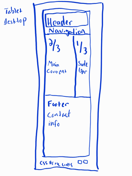
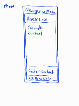
I decided to use a similar layout to the portfolio page, as I felt it worked good giving more room to the main content with enough room to still display images on the sidebar. As per the project instructions, I made it mobile friendly. During the change to mobile layout, I changed the header image to the logo from the original website, as it was lower quality and had a white background instead of transparent. Speaking of the original website, I also used the colors in this website from there, while also adding a couple combinations of the colors to get a more mute purple that compliments both colors. Also, adding horizontal rule tag helped to create an easier to understand hierarchy.