Code
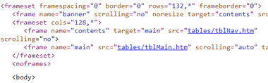
Looking at the code, a lot of it is incorrect. I ran it through the validator and there are 23 errors. Under view page source, I haven't seen the tag framset or most of the attributes that come after it before. When right clicking on the home page again, there is a tool I haven't seen before, which is view frame source. Also, when switching between pages on the navigation, I noticed that it is all in the same website address.
User Interface
This page uses a lot of gray, white and blue. The logo in the top left looks blurry. The main navigation is pushed all the way to the left, but would be better if it was included in the main content so that the main content wasn't pushed to the bottom right.
User Experience

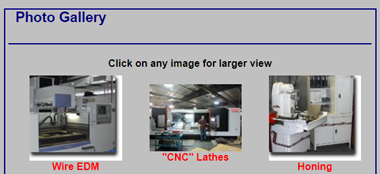
This page hurts to look at. The main content isn't centered, the text is small and the image texts are blurry and hard to read.
Summary
Most of the text on this page is small and hard to read. The text images don't have transparent backgrounds. The main content isn't centered. There are so many things wrong with this website that I want to see if my boss will let me change it once I get my degree. This is the website of where I work, and they still use 2005 monitors. Through my dad, I learned they may not have updated this website in 10-15 years.