Code
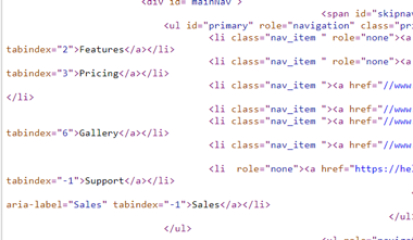
Looking through the code, there weren't any elements I didn't recognize. They use a lot of scripts throughout the page. Further down on the main page's code between two big blocks of numbers, I noticed that they might use wordwrap because of how the code line abruptly ends and start fresh on the new line.
User Interface

Their main page uses a lot of light colors. Unlike Culturedcode, contrast is no issue on the text, and they made the buttons a vibrant color to draw your eye to it. They utalize animations to slowly bring some content onto the screen. The website looks very nice.
User Experience
I noticed on the home page that there is some text that are some small blocks of text that are hard to read. The hover states they use aren't overly abundent like in the envylabs page.
Summary
Overall, this webpage looks and acts great. The only problem I could see was the small text on the front page. The code was a little confusing to look at since I don't know scripts yet.