Code
Looking through the code, there isn't anything that I don't recognize. A lot of the code is familiar, and I didn't notice any elements or tags that haven't been covered in the last few weeks.
User Interface
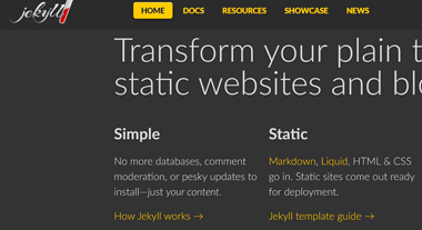
This website uses dark colors with light text. Unlike in Culturecode, the contrast is good and the text is large, making the website easy to read and look at for long periods of time. All of the links have a hover state and are different color, making it easy to tell what is a link. Overall it is very appealing to look at.
User Experience

For this website, there isn't anything to complain about. Between the docs page and the resource page, the lighter gray box does jump around a bit, but doesn't affect the user experience.
Summary
For user experience and interface, this website makes it easy to read and look at for extended periods of time. The contrast makes the text and links visible. I don't know if it was my internet, but some of the images on the showcase page were not showing up for me.