Code
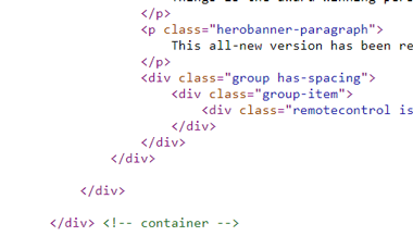
Looking through the code, there isn't anything I haven't seen before. The code, similar to Veerle's code, is done by hand, based on the class names. They used comments to mark what closing tags closed.
User Interface
The main page uses a lot of neutral colors with bright colors, and is appeasing to the eyes. For most of the page, the contrast is fine, except on the text where it shows pricing. I used the website contrast ratio to check the contrast, which ended up not being an accepted level of contrast. They also incorporated videos and a Twitter feed into their site.
User Experience

Aside from some of the text contrast, there isn't anything else to complain about. Everything works and is in a good layout.