Code
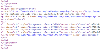
The code this week looks mostly familiar with the exception of the figure, figcaption, defs, and clipPath elements. When viewing the page source, all of the code is alligned to the left, which makes it hard to find opening and closing tags.
User Interface
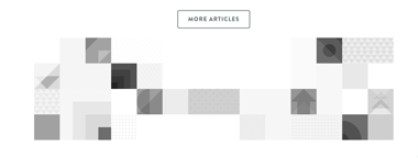
This website has very appeasing colors and animations. The logo animation in the middle of the home page had me refreshing the page to look at it a few times. When hovering over article images, they turn to black and white. The text is big and the typography is easy to read. Overall, the website looks nice.
User Experience
With a lower amount of transitions than last weeks review that are smoother, this website is easier to view for longer periods of time. The pages also load quick without needing a loading screen. The contrast on the text and background was also good.
Summary
For user experience and interface, this website is very good. It is easy to read and has animations that attract the user. The coding does hurt to look at, but that is all up to the developer. The way the animations were done made me want to look through the code to see how it was done, but the coding for it makes little to no sense to me. It is all around a good website.