Code
Looking through the code, I noticed how organized it is, with notes for Google tag manager and the Yoast SEO plugin. There is also a lot of coding I do not understand, such as scripts, jqueries, lines, paths, and ellipse. But after the header closes, the code gets into more familiar territory, similar to Culturedcodes' code.
User Interface
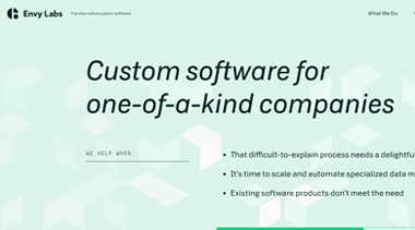
The website looks very pleasing to the eyes with its light shade of green and white with black text. The text is big and easy to read. The background moves when you move your mouse across the screen, which is distracting. All in all I would say it looks good.
User Experience

While the website looks good, there are so many moving pieces that it can be hard to look at the screen for an extended time. Looking at the Cisco case study page and just scrolling through it, they seem to use motion on every single image. This motion is fluid if you don't scroll quickly through the page. The motion only works once per image per page, so if the user does not like the motion, they can scroll through the page and head back to the top to avoid it. The loading screen stays consistant across the website, and helps prevent any slow loading on the page motions.
Summary
This website is very well designed, but has a couple of problems. The appearance has light colors that go together well, and dark text to contrast against the background. However, all of the movements are very distracting and can strain your eyes if you have been on the computer for a long time. After looking at the mobile version, the motions look a lot better, as the images don't take up the full screen.